How to design a wedding album
So your big day has been and gone (but why oh why did it have to end?), and you’ve already trawled through all of the photos on phones, the hashtagged ones that made it onto Instagram, and any that were taken by camera-savvy friends who brought along their fancy DSLR.
Then your inbox pings with an email from your photographer saying that your real deal wedding photos are edited, ready and waiting. You trawl some more, you relive every moment, you laugh, you cry, and after a few more viewings, you’ll start to earmark the chosen ones, your favourite ones, the wedding album ones. And with our wedding album design ideas, you’ll soon know exactly how you want to cherish those that make the cut.
Creating your wedding album
Making your wedding album is such a fun post-wedding activity, but it can be a bit overwhelming to know where to begin.
The best place to start is by getting organised.
Chances are, with the digital world we live in, all of your photos are going to be files stored on your computer and mobile phone. So get them all onto the same device and make two folders – one that’s general wedding memories and one for your wedding album shortlist.
Then start filtering through. Not only is this going to make it easier to upload them to your bespoke Papier album, but it’s a good way to bring together all of your pictures. Make sure you back them up too on a hard drive or USB so they’re 100% safe and sound.Housekeeping over, it’s time to get creative.
Is your album going to have a theme? For example, you might just want a collection of all the most romantic moments from the day, or the funniest. Do you want a traditional theme or something more modern?
A theme can be a good idea if you’re really struggling to whittle down the number of photos to go in your album. A theme gives you focus.Next up, running order.
Chronologically is the most straightforward and sensible approach. That works nicely too because every time you open it, you’ll remember the entire day as it unfolded. But, it’s by no means the only way.
You could group your photos by subject – people, food, flowers, and styling (don’t forget to include photos of your wedding stationery, or scan them in). Or be artsy and arrange your photos by colour for a highly curated effect.And finally, ask yourself which photo is going to make the cover and what your first wedding album caption’s going to be.
Keep things understated but romantic with a photo of the two of you during one of the many candid moments, and a dreamy line like ‘The day we said we do’.
Perhaps you want to keep people for within the pages, in which case, opt for a photo of the venue, the flowers or your ring boxes (a popular shot in the wedding photographer world) with the wording stating the where and when. Or celebrate your wedding album for what is really is – a day that’s all about the two of you – and pick a photo that says L-O-V-E the loudest with your newlywed names beneath.

Wedding album layout
If you fancy keeping your wedding album layout exactly the same from page to page, then easy peasy. That’s a good one if you like simplicity and uniformity. For variety though, you can use our photo book builder to change up the look on as many pages as you like. Once you’ve uploaded all of your photos, we’ll automatically default to the one-per-page layout. The choice is all yours though – it’s your album after all.
This is just to get you started. Switch between a couple of layout templates or try them all – there are 12 to pick from.
- Some people like to open with the blank page option – think of it as a moment to pause between the cover and diving straight in.
- Or at the other end is the full-bleed design where your image fills every inch of paper with no white border in sight – this one makes a big impact.
- Try the little grids of three or four images for things like detail shots – stationery, rings and buttonholes make a lovely trio.
- We also love the long landscape layout for foodie images where you can take in what the top table looked like laden with food, flowers and candles.
Wedding album design ideas
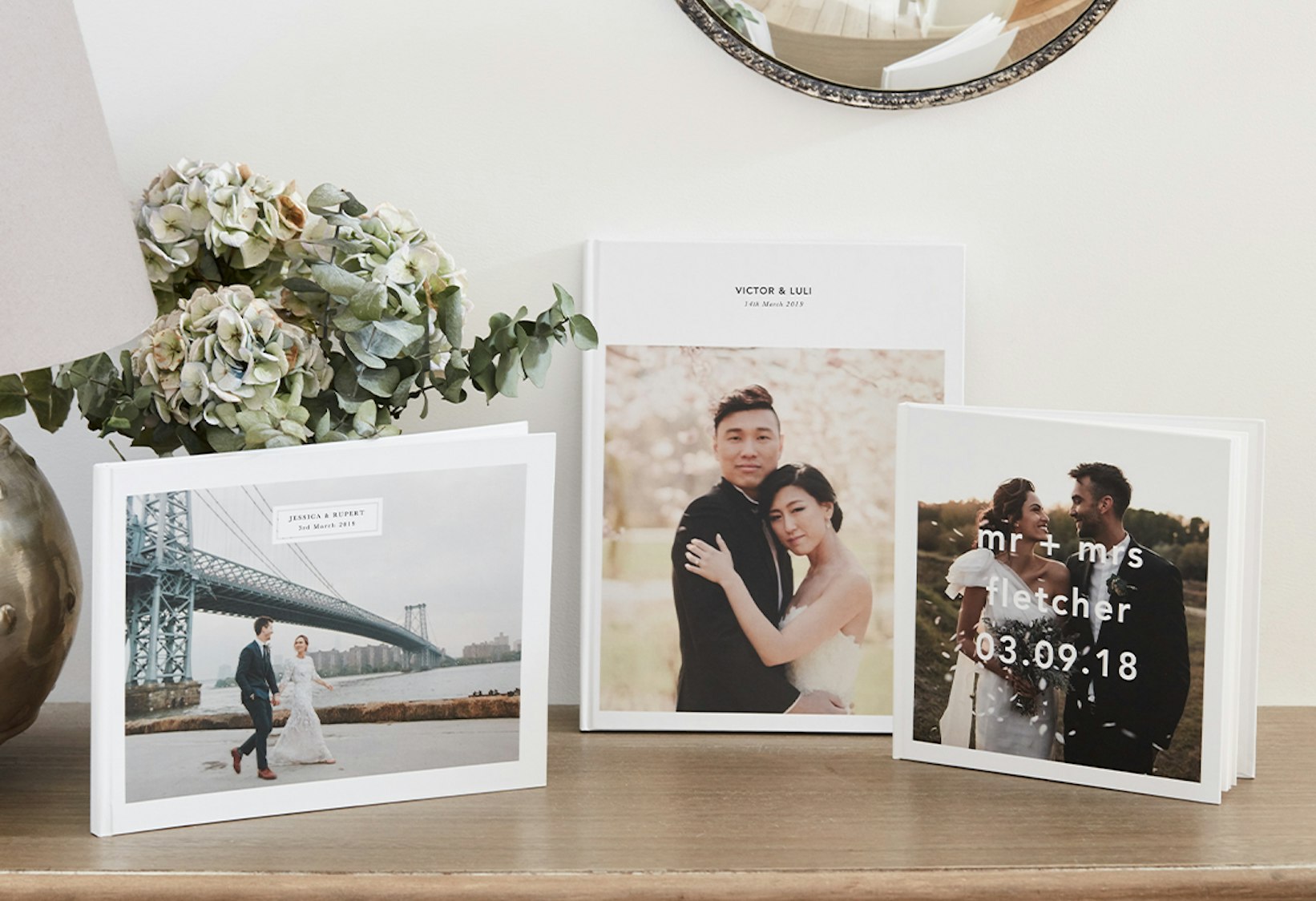
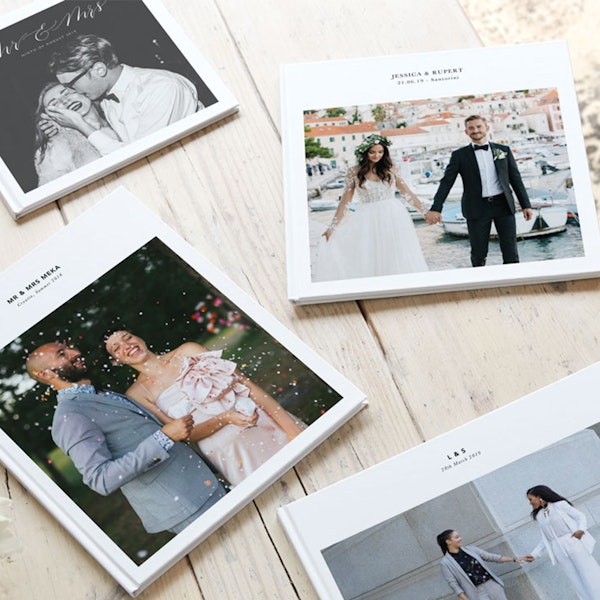
A huge part of your personalised wedding album is about way more than the photography. The look and feel of your book counts for plenty. That’s why our photo book options cover all sorts of different styles and shapes, from soft back to hardback, landscape to portrait (and square if rectangles aren’t your thing), and a whole host of font options to cover every typography taste.
You might be drawn to one specific look in a heartbeat, but if you’re on the fence, you can mock up your design with your photos and wording rather than decision-making with our template. It helps all of the puzzle pieces fall into place to help you find the one.
Wedding album quotes and captions
A picture says a thousand words, or so the saying goes. That doesn’t mean to say that your photo book should be without snippets of speech. Wedding album quotes dotted throughout are another design tip for adding doses of real meaning that will move you every time you flick through the pages.
And if you’re stuck for words, have a rummage through your guestbook (if you had one) and type up some of the jotting-downs that made you laugh out loud or shed a tear.
Another idea would be to take a line or two from the song lyrics of your first dance as husband and wife or from readings said during your ceremony. And don’t forget vows, especially if you wrote your own.
If you’re a bit of a wordsmith, you could always include a caption for every single image, noting how you remember feeling at the time that photo was taken, or what you love most about the scene captured.
Wedding album templates
To make designing your photo book keepsake easier still, we have our Papier wedding album templates that are ready-made for you to customise with your bespoke content. Go for our design The Minimalist if you want to create a cool, calm and collected album that could be mistaken for a pared-back fashion publication.
The Wedding Of… template is classically romantic with its cursive fonts, and then there’s our third design – the one that’s inching more towards the traditional side of things. Whichever of the three templates you select, there’s a whole host of cover designs and sizes to muse over – templates within templates if you will!
Sending your wedding album off to print
And you’re all done. People might be more digitally-minded these days, but nothing quite beats a bit of analogue when it comes to stationery. And a computer album or slideshow of your wedding snaps just won’t cut the mustard.
Here at Papier, we believe that designing your wedding album shouldn’t cost an arm and a leg (no more talk of wedding-related budgets, please!) and it shouldn’t be such a fiddly affair to create.
In a hop, skip and a jump, you’ll have designed something totally beautiful and entirely bespoke to your style and your special day. And in less than a week’s time, it’ll be printed, bound, and wrapped up tight to make its way to your newlywed nest.
