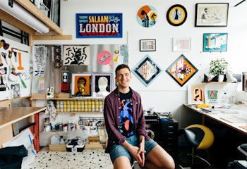
Archie Proudfoot has been a key artist in the renaissance that sign painting has enjoyed in recent years. His skill with lettering and steady hand with gold leaf has seen him transform shop windows, hotel lobbies and gallery walls. We stopped by his studio to get an eyeful.


How did you start sign painting?
I'd graduated in English Literature from uni and was at a bit of a loose end with myself. I knew I wanted to commit to something technical that I could spend a long time mastering. Ideally a craft that would allow for my creative side, which had been put in a bit of a box while studying, to come forward again. Sign painting ticked all those boxes. I had never really heard of the craft at all until I was about 22 and I discovered it through the work of Steve Powers, who was using its aesthetic to create incredible large scale public artworks in New York and Philadelphia. I fell in love with all aspects of it quite quickly, went on Joby Carter's week-long intro to sign painting course and after that I knew I wanted it.

There was quite a long period though where I didn't think it was at all feasible as an actual job, this was still very much in the early stages of its renaissance and there were only a handful of jobbing sign painters around. A family friend then asked if I'd paint his shop sign, an antiques shop in Herne Hill called The Society for the Protection of Unwanted Objects. That was a lot of characters for my first fascia and it was January, so it was very tough, but I'd never felt a work satisfaction like it. I knew afterwards that this was 'it'.


What’s a usual week like for you?
The fact that this is such a difficult question for me to answer is part of why it’s so enjoyable, it varies pretty heavily. I could be spending all week on a freezing building site painting solidly for ten hours a day. Or I could be in my studio in Manor House working on a new piece of personal work. The best weeks are usually a mixture of the two. If I spend too long in the studio I often go a little stir crazy, getting out and about and getting a job done for someone, even if it is with numb hands, gives that nice dose of manual satisfaction and adventure that comes with painting a sign on a London street.

What’s your favorite word or letter to paint?
No real favorite word but the recurring words like 'the' and 'and' are always something that need some injection of style or signature. In terms of letters, capital R is a strong favorite – it’s got a bit of everything.

What should a good sign do?
I often find myself advising clients that they want their sign to show rather than tell information. This is often just to talk them out of asking me to paint more characters than I want to but it's genuinely key to creating an effective piece of work. The type style, layout, sizing and colour choices should do virtually all the talking. Almost all of the information that a sign conveys should be done with those tools and with as few actual characters and words as possible. A good sign makes you want to patronize that business without you really knowing why, not because you spelled it out for them.


Do you find yourself often looking at the shapes of letters on signs and typography on menus, etc., more than the message of the words when you’re out and about?
Yeah absolutely, the styling is effectively the message.
When you create a sign for a business, how much is your own style and how much is it creating a style that reflects the nature of the business?
That really depends on how aligned they are to my aesthetic or not. More often than I would like, clients come to me having already employed a designer. I then only really advise and then execute something I have no creative attachment to. Invariably these signs are a little flat – regardless of that designer’s skill or the quality of what they've given me to work with, it hasn't been created with a sign painter's mindset of what will produce the most 'eye appeal' on street level, and my heart's not really in it because of that. I'm trying to weed these kind of jobs out of my workflow but ultimately they're good for keeping the lights on and giving me time in the studio to play around.


What’s your process when creating a new sign?
I'll talk to the client first to get more information about their business, get a feel for them and their aesthetic. It's good to do this while looking at the space where the sign will go. Getting a handle on where it will sit on the street, how passersby will see it etc, can be key when you come to think about an effective design. I'll explain all of this to client while I'm doing it to look professional and like I know what I'm doing – hopefully they're fooled.

Then it's about getting some sketches done, or just scale mockups if I'm working with given designs. I usually fall for my first idea and then sketch out a couple more to give them something to choose from, they then invariably choose the 'wrong' one in my mind but then that's the nice thing about doing commissioned creative work – it forces you out of your comfort zones. By the time it's done, that first idea I fell for has lost all its sheen and the 'wrong' one now feels right, because they picked what was right for them and their business, not what was right for me.

What's next for Archie Proudfoot?
I'm finishing up the self portrait that you can see in the photos which has been a very interesting experience, exploring new ground technically as well as creatively. Then I'm getting into the post-production of my directorial debut, creating a music video for the band Sugarcane. The shoot was a huge step into the unknown for me and I was incredibly scared about the whole thing, I nearly ran from the entire project a few times but now I'm so glad I didn't. There's nothing quite like the rush that comes on the other side of a big creative fear barrier. So hopefully what's next is more of that barrier breaking and a little less time spent on things my heart’s not really in.
Archie's Papier Picks
You can see more of Archie's work over on his website.


